Fonts, Syllabi, and Poop
TAPP Radio Episode 123
Episode
Episode | Quick Take
Host Kevin Patton revisits the concept of using the syllabus and other course documents to build a positive and productive course culture. Poop—it’s everywhere! Does the font or typeface we use affect students—especially regarding learning and memory? We look for answers in this episode!
- 00:00 | Introduction
- 00:52 | Revisiting the Syllabus
- 16:28 | Poop. Poop. Poop.
- 19:00 | Sponsored by AAA
- 19:59 | Fonts Are Important in Teaching & Learning
- 30:54 | Sponsored by HAPI
- 31:57 | Desirably Difficult Reading?
- 42:00 | Sponsored by HAPS
- 43:00 | Fluent & Dysfluent Fonts
- 56:12 | Staying Connected

Episode | Listen Now
Episode | Show Notes
Typography must often draw attention to itself before it will be read. Yet in order to be read, it must relinquish the attention it has drawn. (Robert Bringhurst)
Revisiting the Syllabus
15.5 minutes
Creating and nurturing a course culture can be influenced by our syllabus and other course materials. We revisit this idea with a few more tips and tweaks.
- Anatomy & Physiology Syllabus: It’s an Art | TAPP 120
- Are We Answering Student Questions? | Science Updates | TAPP 92
- Wendy Riggs has a huge collection of anatomy, physiology, and general bio, instructional videos she uses in her flipped classes youtube.com/user/wendogg1
- Natalie Wade has engaging short videos about A&P content and study tips at The Anatomy Gal youtube.com/c/TheAnatomyGal
- Jamie Chapman has a collection (Chapman Histology) of short (under 3 minutes) videos guiding students through lessons in histology youtube.com/c/ChapmanHistology

Poop. Poop. Poop.
2.5 minutes
After releasing The Poop Episode | Using Fecal Changes to Monitor Health | TAPP 121, I learned of a whole movement of poop listening on smart speakers. And that there are actually poop songs that are viral hits. Really.
- When kids yell ‘Alexa, play poop,’ you’ll hear these songs (story from All Things Considered on National Public Radio) AandP.info/wv2
- The Foot Book (Bright & Early children’s book by Dr. Seuss; can be read as The Poop Book) geni.us/afvGc
- CHOC Stool Diary AandP.info/4yq
- Bowel Symptom Journal (from Alberta Health Services) AandP.info/6fw
- Poop Apps: 5 Tools for Tracking Your Stools AandP.info/5ow
Sponsored by AAA
56 seconds
A searchable transcript for this episode, as well as the captioned audiogram of this episode, are sponsored by the American Association for Anatomy (AAA) at anatomy.org.
Don’t forget—HAPS members get a deep discount on AAA membership!
AMERICAN ASSOCIATION FOR ANATOMY STATEMENT OF RESPONSIBILITY FOR ITS HISTORY OF RACISM (Press release from AAA, giving the full text of the statement) AandP.info/eei
![]()
Fonts Are Important in Teaching & Learning
11 minutes
At the suggestion of listener Dr. David Curole, we examine the roles that different fonts can play in teaching, learning, and memory. This segment reviews some past discussions of fonts, then introduces some new concepts of using fonts in teaching. Featured is a Word Dissection of the terms fluent font and dysfluent (disfluent) font.
- Communication, Clarity, & Medical Errors | Episode 55
- Anatomy & Physiology Syllabus: It’s an Art | TAPP 120
- Why Anatomy & Physiology Students Need Sectional Anatomy | TAPP 116
Sponsored by HAPI Online Graduate Program
59 seconds
The Master of Science in Human Anatomy & Physiology Instruction—the MS-HAPI—is a graduate program for A&P teachers, especially for those who already have a graduate/professional degree. A combination of science courses (enough to qualify you to teach at the college level) and courses in contemporary instructional practice, this program helps you be your best in both on-campus and remote teaching. Kevin Patton is a faculty member in this program at Northeast College of Health Sciences. Check it out!

Desirably Difficult Reading?
10 minutes
The article How Fonts Affect Learning and Memory by Carla Delgado takes our conversation a step further by looking the potential role of dysfluent fonts in learning.
- How Fonts Affect Learning and Memory (article in Discover Magazine by Carla Delgado mentioned in this segment) AandP.info/wof
- A Review of the Cognitive Effects of Disfluent Typography on Functional Reading (review article from The Design Journal) AandP.info/mwt
- Fortune Favors the Bold (and the Italicized): Effects of Disfluency on Educational Outcomes (article from Proceedings of the Annual Meeting of the Cognitive Science Society) AandP.info/jjt
- Changing Fonts in Education: How the Benefits Vary with Ability and Dyslexia (article from The Journal of Educational Research) AandP.info/yt4
- Fluency and the Detection of Misleading Questions: Low Processing Fluency Attenuates the Moses Illusion (article from the journal Social Cognition) AandP.info/jul
Sponsored by HAPS
56 seconds
The Human Anatomy & Physiology Society (HAPS) is a sponsor of this podcast. You can help appreciate their support by clicking the link below and checking out the many resources and benefits found there. Watch for virtual town hall meetings and upcoming regional meetings!
![]()
Fluent & Dysfluent Fonts
13 minutes
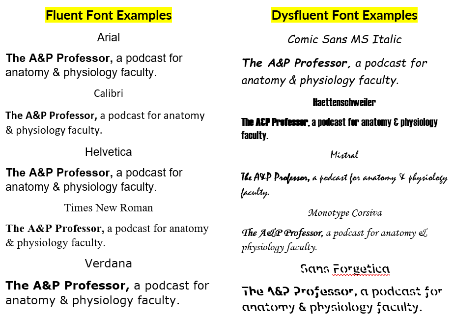
We identify some potentially fluent fonts, as well as a few dysfluent fonts (see image below or at AandP.info/ihy). Sans Forgetica font was developed specifically to be dysfluent in a way that promotes remembering what is read. Does it work? Should we incorporate dysfluent fonts in our teaching materials?
- Fonts and Fluency: The Effects of Typeface Familiarity, Appropriateness, and Personality on Reader Judgments (thesis by Tim Wang) AandP.info/0hf
- Previously claimed memory boosting font ‘Sans Forgetica’ does not actually boost memory (story from ScienceDaily) AandP.info/zp4
The science of Sans Forgetica – The font to remember (video from the creators of Sans Forgetica) AandP.info/ox5 - An unforgettable year – Sans Forgetica turns one (article from the RMIT University website) AandP.info/fo3
- Sans Forgetica: Study Mode by RMIT University (plugin for Chrome browser lets you read any web page in Sans Forgetica) AandP.info/fc3
- Sans Forgetica (free download for personal use) AandP.info/o4g
- Can very small font size enhance memory? (article from journal Memory & Cognition) AandP.info/rlk
- Sans Forgetica is not desirable for learning (articl from the journal Memory) AandP.info/hmu
- The role of font size and font style in younger and older adults’ predicted and actual recall performance (article from
Neuropsychology, development, and cognition. Section B, Aging, Neuropsychology and Cognition) AandP.info/r6s
People
Contributors: David Curole, Terry Thompson
Mentions: Wendy Riggs, Natalie Wade, Jaime Chapman, Robert Bringhurst, Carla Delgado
Production: Aileen Park (announcer), Andrés Rodriguez (theme composer, recording artist), Rev.com team (transcription), Kevin Patton (writer, editor, producer, host)
Need help accessing resources locked behind a paywall?
Check out this advice from Episode 32 to get what you need!
Episode | Transcript
The A&P Professor podcast (TAPP radio) episodes are made for listening, not reading. This transcript is provided for your convenience, but hey, it’s just not possible to capture the emphasis and dramatic delivery of the audio version. Or the cool theme music. Or laughs and snorts. And because it’s generated by a combo of machine and human transcription, it may not be exactly right. So I strongly recommend listening by clicking the audio player provided.
![]() This searchable transcript is supported by the
This searchable transcript is supported by the
American Association for Anatomy.
I'm a member—maybe you should be one, too!
![]()
Introduction
Kevin Patton (00:01):
In his book, The Elements of Typographic Style, Robert Bringhurst wrote, “Typography must often draw attention to itself before it’ll be read, yet in order to be read, it must relinquish the attention it has drawn.”
TAPP Orchestra (00:18):
[theme music]
Aileen Park (00:20):
Welcome to The A&P Professor, a few minutes to focus on teaching human anatomy and physiology with a veteran educator and teaching mentor, your host, Kevin Patton.
Kevin Patton (00:32):
It’s episode 123, and I’ll give you more tips on building a positive culture through the tone that we use in our course documents, and I discuss some edgy ideas about which fonts to use for better learning.
TAPP Orchestra (00:47):
[theme music]
Revisiting the Syllabus
Kevin Patton (00:53):
In episode 120, which was called Anatomy and Physiology Syllabus, It’s An Art, I talked about being artful in our syllabus, creating and nurturing the kind of culture that we want to see in our course, whatever that is for each of us. For example, do we value integrity? Well, let’s build integrity in our course. Do we want to include inclusion? And that is, do we want to make sure that we have a culture of including all students? Do we want to have mutual support? Do we want to nurture that in our course? Well, there’s all kinds of directions we can go, and the syllabus is a way to start guiding any course or course section along that desired path. As usual, after the episode aired, I thought of a few more things I could share. I always do. So, I’ll take a few minutes at the beginning of this episode to do that.
Kevin Patton (01:56):
One thing that I want to emphasize is that it’s a process. That is, our syllabus, and our other course materials, really, are something that we should be tweaking over time. And you know what? That early in the semester is a good time to go back to those initial course documents such as the syllabus and take a good look at them and think about, “Well, you know, okay, it’s been a few weeks, or maybe a few days or few hours since I introduced the syllabus. What are some pain points? What are some things that I need to make clear? What are some questions that I got that should have been answered in the syllabus and weren’t answered in the syllabus or somewhere else, at least, in my course documents?”
Kevin Patton (02:46):
So, now is a good time to make those changes because if you’re like me or pretty much any other human on the planet, you’re not going to remember those changes that occurred to you during the first part of the semester because too much time will have gone by, too many things will have happened, and you’re going to forget about all those questions you got about that one topic missing from your syllabus, or you’re going to forget about how unclear some part was, or you’re going to forget about that great idea for a syllabus that you heard from this friend or that friend, or even from students. Sometimes I’ll hear from students that, “Hey, you know, in this other course or in the lab section, my lab instructor put something in the syllabus that I thought was really cool or I thought was really helpful.” Well, when you hear those things, well, I have a pocket full of three by five cards. You may already know that because I’ve mentioned that on past episodes, and I will write down on those cards those ideas.
Kevin Patton (03:47):
But you know what? Those cards get lost if I don’t do something with them pretty soon, so that’s why it’s always a good idea to go ahead and make those changes, and my syllabus is somewhat fluid, so I tell students, “Hey, if I can make something better or clear in the syllabus, I’m going to do that even during the course,” because my syllabus is posted online, and my other course materials are as well, so I just go in and make a change for this semester if it’s appropriate to do that. Or maybe I’ll just go ahead in and make a copy of that and save it for next semester. So, those are a couple different ways to handle it. There are other opportunities to set the tone in our course through the various documents that we produce, and there are a lot more than I think we often think about. I know that’s true for me. I’m thinking, “Wow, there’s all kinds of opportunities I have in my courses where I can go in and help set that tone that I want, help build that culture that I want to see growing in my course.”
Kevin Patton (04:51):
So, where are those places? One place that you may not be thinking about is your online test instructions. If you have online tests or you have online quizzes or online assignments, there’s usually a place to put instructions in the learning management system for just that test or quiz or assignment, and you may use that to give specific instructions. Or, what I’ve done a lot in the past is just leave it blank. I mean, it’s a quiz. You know, just start with one and then go to two and then go to three and answer each one. I don’t think I need to write that part of it out. But for quite a while now, I have instead been putting little notes to the student, just very brief notes, but they’re different for every quiz and every test, because if they get the idea that, “Oh, it’s just boiler plate and it’s the same every time,” they’re just going to skip over it and not read it, even if it’s something that I think they should be reminded of over and over again. I’ll find a different way to say it or at least introduce it differently, and I will certainly take the opportunity to project that voice that I want to project and build that culture that I want to build.
Kevin Patton (06:04):
So I might say, “Hey, this is the first test. If you run into any trouble, don’t worry about it. I’m here to help you. Just get ahold of me and I’ll help you through it.” Or I might give another kind of encouragement and say, “Wow, we’re on to our second test already. Maybe you’re getting the hang of it, but if you’re not getting the hang of it then, come and see me and we’ll talk about it.” And there’s one course I teach, pre-A&P, where test number four is, it’s almost always a hurdle for students, and I think I’ve worked out why, and it’s not something I need to fix. It’s actually a good thing that they’ve gotten to a point where they really need to ramp up their efforts a little bit, and so I give them some encouragement and say, “This test number four is a tough one for some students, so don’t be discouraged if you have a little bit rougher time with it. But if you get stuck, I’m here to help you.”
Kevin Patton (07:01):
Now, in each one of those sets of instructions, I will also end it with a couple of links to some online test advice that I have available for students, and that includes not just, you know, “Here’s a good way to approach an online test,” but I also have some things that are like quirky things about the learning management system that I use. Like don’t have any trailing spaces in your fill in the blank answer because it won’t be accepted because spaces are not part of the answer. There are things like that that I need to remind students of, and I put that in there, so hopefully they’ll take a look at those at least once as they’re progressing through the tests and my course.
Kevin Patton (07:46):
But there’s other opportunities that we have in our course documents to set the tone for our course. For example, in handouts, any kind of handouts or outlines that we give, there’s plenty of opportunities to build in little messages here and there, maybe in a little box so that it’s separate from the content part of it, the A&P content. But in that little box, maybe it’s an inspirational quote. Maybe it’s just a little message of encouragement or a message of support or a reminder about academic honesty, but not in a scolding way, but in a supportive way. If we start scolding students all the time, then yeah, I don’t think that’s the kind of course I want to build. That’s not the kind of course culture I want to have.
Kevin Patton (08:29):
Sometimes I rewrite them and think about them, and sometimes I make a mistake and then take it away and put something else there instead, especially if I get feedback from students like, “Hey, that was kind of snarky.” Like, “Oh. Yeah, I guess it can be read that way.” Or, “Yeah, maybe that’s what I was thinking when I wrote it,” and so I’m going to take that out or replace it with something else or rework it in some way. But other things too, like emails and direct messages, maybe through the learning management system. Before I press send, I always look back through it and make sure that I start off with an acknowledgement of their potential frustration. Say, “Yeah, boy, I hate when that happens.” Or, “Oh, gosh, that must be frustrating.” Or, “Oh, I hope you’re feeling better now,” or, “I hope you’ll be feeling better soon,” or some kind of a acknowledgement of whatever it is that the student contacted you about, and a supportive kind of acknowledgement.
Kevin Patton (09:28):
And then I want to make sure that I’ve answered their question, because don’t you hate that? And I’ve mentioned this in previous episodes. Don’t you hate that when you contact customer service and they end up never answering your actual question? They just see some key word in your question and assume, “Oh, yeah, somebody asking about this again,” and then they just paste in that boiler plate answer that in your message you already said you tried that solution and it didn’t work, and they’re not really reading your answer. So, I want to make sure that my message reflects that I’ve read their question and that I’m really answering their question, and if I’m not sure I’m answering their question, then I’ll put the question and “Hey, I think this is what you asked, and I think this is addressing your question, but if it’s not, please let me know.”
Kevin Patton (10:15):
Another thing that I do at the end is I do another one of those encouragement things like, “Yeah, you did the right thing by reaching out to me. You can always reach out to me.” Or, “Don’t ever hesitate to reach out to me,” or that kind of a supportive statement. So, I do that last minute double check of, “Did I do all of these things that I want to do?” Because, you know, as you’re rushing through things, sometimes you forget to do some of those things, even if they’re a habit for you, sometimes we forget. Another thing that I want to mention very briefly is that there’s lots of examples of that positive, supportive tone that we can develop in our own learning materials, and one area that I think it’s, and I don’t know if it’s easier or harder to do this in, is in videos, or in cases like this a podcast. I think that by listening to my voice, especially over the course of several episodes, you kind of get an idea of where I’m coming from and the kind of culture that I’m trying to build in this podcast among anatomy and physiology educators, and the kind of approach that I want to be taking with sharing my experience and information that I run across in these podcasts.
Kevin Patton (11:35):
So there’s audio, but also video. Video can do the same thing, and so we want to be very intentional about that and not have them just be a remote reading of facts when we put out instructional videos. So, I have a couple of collections of videos that I want to share with you that I think really project that positive supportive kind of culture that we want to build in our courses, and they’re very different from one another, but that’s because they should all be unique to us. We shouldn’t copy somebody else’s persona, but we should look at what they’re doing and see, “Is that something that fits my personality and my way of doing things in the way I want to approach my course?”
Kevin Patton (12:21):
So I have links in the show notes and at the episode page, but I’ll just mention what they are now. One is Wendy Riggs, a former president of HAPS, and you may have seen some of her videos or her various presentations in HAPS and through other venues as well. She has a huge collection of anatomy, physiology and general bio instructional videos that she has posted and she uses in her flipped classes, and so you might want to take a look at a few of those. I warn you, if you watch a few of them, you’re going to want to watch more of them. But I have a link to her YouTube channel where she posts all of these videos, and they’re open to everybody, so I share them with my students too as another resource that they can use for these topics.
Kevin Patton (13:11):
Another one is my friend Natalie Wade, who produces videos and other materials with the name The Anatomy Gal. She has a different approach than Wendy, but it’s still a very positive and entertaining and supportive approach to her videos. So, she has a YouTube channel and TikTok and all kinds of things, and those are very short videos about A&P content, but she also has a lot of study tips mixed in there too, so I share a lot of those with my students as well.
Kevin Patton (13:46):
Another one is from Jamie Chapman, who is a histology professor, and he has a whole bunch of three minute videos where he walks people through a particular histological image. I think that’s one of the things that students really need is a lot of practice with the things they’re learning in histology is an area where, yeah, boy, if you’re not practicing, you’re not learning histology. And there’s tons of those at all different levels, at beginning levels and advanced levels, and he also has some summary, three minutes or less, usually, these short, short videos where he just summarizes some principle, especially the beginning principles of histology. So you can curate those and see, well, what fits in your course and use those, so that’s a good resource, but also he has his own particular style of presenting it in a very clear and supportive way, and so you might want to take a look at those.Now, there are lots of other ones out there, and I hope I’m not offending anyone by leaving your set of resources off of my list.
Kevin Patton (14:58):
One last point that I want to make about these course materials is I think it’s important to be redundant in them. So if in one place I’ve already explained to students, be careful about putting extra trailing spaces at the end of your answer when you’re filling in a blank, just because I have it in one place doesn’t mean my students will ever see it, and it doesn’t mean if they do see it, they’ll ever take it to heart. Or if they do take it to heart, it doesn’t mean they’re ever going to remember it. So, yeah, you know, I need to put that in a bunch of different places. There are some things that even in my syllabus I mention in more than one place, like how to contact me. Yeah, there’s this little section where it says, “contact the instructor”, but you’ve had this experience. I know you have. Where students will just completely overlook the section with the big heading on it that says, “faculty contact information” or “how to contact your instructor”, or whatever it is that they should have seen easily, and they just completely overlook it.
Kevin Patton (16:02):
You know, “Officer, I didn’t notice that big red stop sign. Really. I didn’t.” And so maybe we need another stop sign there. That is, maybe we need to be redundant in our course materials, including the syllabus. So, a few more ideas about the syllabus and other course materials that we can use to build that culture that we want to build.
TAPP Orchestra (16:25):
[music]
Poop. Poop. Poop.
Kevin Patton (16:29):
Well, here’s another topic from a previous episode that I want to briefly revisit, and that is poop. The poop episode, episode 121 was all about, well, how we can use the process of defecation and feces and related topics to teach some important integrated principles about human anatomy and physiology. And in that episode I mentioned that, well, when you talk about poop, it’s kind of alarming to some people. It’s also funny to kids, and I dare say to adults that, you know, I don’t know why it is that we find that poop is funny, but it is. And just after that episode came out, I was listening to National Public Radio and a story came up about poop where they said, you know, “If you say Alexa, play poop,” which by the way, this is the second time I’m recording this segment because the first time I forgot to unplug my little Amazon device here, and Alexa started playing poop, and what did she play?
Kevin Patton (17:45):
Well, there’s all kinds of very popular poop songs. Some of them, that’s the only lyrics is poop, poop, poop, and it kind of reminded me a little bit of what I did in episode 121 where I recalled the story of when my kids were younger and we took Dr. Seuss’s the Foot book and swapped out the word poop for the word foot. So we had, you know, one poop, two poop, poop, poop, poop, all the poops we meet. They thought that was hilarious. I thought it was hilarious. It still makes me smile when I think back on that event, and that’s become a thing, according to this NPR story, that people are having their smart speakers, or kids are doing this, they’re discovering this, like, “Alexa, play poop,” and they might get one or another of some very popular, I dare say viral, poop songs and other poop related content. Who would’ve thought? So, just a little poopy thing to share with you.
TAPP Orchestra (18:56):
[music]
Sponsored by AAA
Kevin Patton (19:00):
A searchable transcript and a captioned audiogram of this episode are funded by AAA, the American Association for Anatomy. Check it out at anatomy.org. I was at the website the other day and I ran across something from last spring called American Association for Anatomy Statement of Responsibility for Its History of Racism. That was really interesting, and really important, I think. It was very candid about AAA’s historic role in racism and very clear about its commitment to do better. I really recommend that you read it, mull it over and talk to your colleagues about it. It’s at anatomy.org, then click Newsroom in the News and Journals tab at anatomy.org.
TAPP Orchestra (19:54):
[music]
Fonts are Important in Teaching & Learning
Kevin Patton (19:59):
I’ve discussed the fonts that we use several times over the years in past episodes. For example, in episode 55, Communication, Clarity and Medical Errors, I explained why we call uppercase font uppercase and lowercase font lowercase. It’s the drawer or case of metal pieces of type used in traditional methods of printing. The big letters go in the upper drawer and the little letters in the lower drawer. In a segment called A Case for Proper Case, I mentioned that when we properly capitalize terms, it demonstrates our professionalism. It serves as a teaching model for students. It improves clarity and it potentially reduces medical errors. I also mentioned in that and other episodes that using all caps or bold for emphasis in our syllabus and other course documents should be used carefully. All caps can be perceived by the reader as shouting when we merely want to call attention to it.
Kevin Patton (21:15):
I honestly think that sometimes I am shouting in my head when I put stuff into my syllabi or my handouts or instructions for students because, well, I’m thinking of all the things I’ve seen students get wrong and I want to get their attention and stop them from doing that before they start. Besides the issue of what tone I want to convey, which is a positive, supportive tone and not an authoritarian, rigid and perhaps even grumpy tone, which is a concern I discussed in episode 120 about the art of making a great A&P syllabus, and also in an earlier segment of this episode. I also don’t want a body of text that is mostly bold, underlined, and italic font and colored fonts, and I don’t know. If nearly everything there is emphasized with font effects, then really none of it stands out. None of it is perceived as particularly important.
Kevin Patton (22:29):
It’s all, well, equally important, I guess, and there’s none of the intended reactions of, “Oh, I better pay attention to this little nugget,” because they’re all little nuggets that are emphasized in some way. They’re all equal. There’s some evidence that bold face font is perceived as important, so using a bit of that in our teaching materials could be helpful. In a syllabus, certain phrases or statements might be better in bold, but we have to be careful, because if it’s mostly bold, it stops looking important. In an outline or a textbook, bold font is good for highlighting key terms, but only if you sparingly. If dozens of terms on each page are bold, then, well, maybe they won’t benefit so much from being bold.
Kevin Patton (23:28):
Also in episode 120, I mentioned that using font effects to designate titles, headings, and subheadings in our syllabus and other course documents must be accompanied by the title and heading style codes embedded in the software, such as Microsoft Word documents or Adobe Acrobat PDFs or HTML webpages. The reason for that is that students or colleagues that use automated screen readers have a hard time navigating and understanding your document because that screen reading software uses the title and heading style codes or tags to tell us that something is a heading and what level of heading it is. Really, it’s a pretty big deal for making our course materials accessible to everyone and therefore inclusive of all students.
Kevin Patton (24:32):
In several episodes in which I gave tips for creating effective slides for teaching, I emphasized the importance of using a large clear font. As part of the discussion in episode 116, I explained that the point sizes of fonts are not what many of us assume they are. A 24 point font in one font family such as Arial or Times New Roman could be significantly larger or smaller than 24 point font in a different font family. Don’t worry. I have a list of links to those in other episodes that discuss how considering the wise use of fonts can help us be more effective in teaching. Just check the show notes where you’re listening to this episode or go to the episode page at theAPprofessor.org/123.
Kevin Patton (25:33):
One reason I’m mentioning these previous discussions is to remind you of them so you can go back and review and refresh them. Yikes. I just heard myself talking to you like I was talking to my students. You may want to go back and refresh what we already know about this concept from previous classes before we start our next learning module. Yeah, I do that a lot and I think that’s helpful. I do that in my own self learning. I go back and refresh things that I need refreshing on, and I need refreshing on just about everything that I haven’t seen or heard of or thought about in a while.
Kevin Patton (26:13):
The main reason, however, that I mention these previous discussions is I have some other things I want to discuss about fonts, and I want to remind you that fonts are important and that we’ve already been paying attention to them. A new thing I want to discuss is the difference between what are sometimes called fluent fonts and what are called dysfluent fonts and why that could be important in teaching and learning. Now, this is a topic suggested by podcast listener David Curole, who sent me some of the resources he’s used to better understand these concepts. Now, I’m going to circle back to some of those in a minute, but again, I want to let you know that I’ll have links to these and other resources and I’ll have a few illustrations of some of the fonts. If you can’t see them in your podcast player, then again, just go to theAPprofessor.org/123 to see them.
Kevin Patton (27:16):
I also think this is a good time for a little bit of word dissection, which is something we all do when teaching A&P. That is, we introduce a new term, then dissect its word parts to see what its literal meaning is. That not only gives us insights to the underlying concept, but it helps us understand and remember other new terms we’re adding to our vocabulary. Let’s start with the word fluent. Fluent is a form of a Latin word that means flowing. When we use fluent in English, it often refers to something that is spoken or written with ease. That is, smoothly. It flows. But we’re talking about fonts here, so a fluent font is one that is written smoothly and is not only easy on the eyes, that is easily legible, but it’s also somewhat graceful. The prefix dis, as in dysfluent is D-Y-S, and that’s a prefix that we’ve all seen frequently, and most of us already know it comes from Greek, and it means ill or sick or bad.
Kevin Patton (28:38):
So, the term dysfluent could be translated as flowing badly. It’s probably more meaningful to say that a dysfluent font is harder to read than a fluent font. However, for the purposes of this discussion, I need to clarify that when I refer to dysfluent fonts, I mean that they’re just a bit harder to read than fluent fonts. That is, a little bit harder to read than easily legible fonts. I’m not referring to what physicians used, what they used to write on their old prescription pads, which were often almost but not quite illegible. I’m instead referring to fonts that, no, they slow us down a bit and make us work a bit harder to read them, but they don’t distract us enough to, well, stop the train entirely.
Kevin Patton (29:36):
I might also mention that some people use the prefix D-I-S rather than D-Y-S for dysfluent. D-I-S is a prefix that is a simple negation, and it doesn’t really have the connotation of sick or bad that D-Y-S has. I think probably the D-Y-S prefix works better for fonts in this discussion, but you’ll see D-I-S used in some of the research papers about dysfluent fonts. So really, either term works okay, and you’ll see either term in the literature. At least I have. I also want to mention that there are other kinds of dysfluency in written language, such as the dysfluent handwriting scene in some motor conditions. And there is, of course, dysfluency of spoken language as in stuttering. There’s a whole world of dysfluency out there that’s worth exploring. But you know what? We’re not going to do all that now. In a minute I’ll be back with some ideas about fluent and dysfluent fonts and how they might impact teaching and learning anatomy and physiology.
TAPP Orchestra (30:50):
[music]
Sponsored by HAPI
Kevin Patton (30:55):
The free distribution of this podcast is sponsored by the Master of Science and Human Anatomy and Physiology Instruction, the HAPI degree. As one of the faculty of this program at Northeast College of Health Sciences, I’ve seen people with lots of teaching experience and lots of people with no teaching experience thrive in our program. You need an advanced degree to enter. So, you know, if you’re thinking that you’ve reached the pinnacle of your learning about how to teach A&P, well, think again. We have a great mix of peers in each cohort, and they always form a small but tight network that supports them way beyond their HAPI graduation. Check out this online graduate program at northeastcollege.edu/hapi, that’s HAPI, or click the link in the show notes or episode page.
TAPP Orchestra (31:53):
[music]
Desirably Difficult Reading?
Kevin Patton (31:57):
In a previous segment, I reminded us that we probably ought to think about fonts that we use in our course materials, and I reviewed a few previous ideas I brought up in this podcast about fonts. Then I introduced the pair of antonyms, fluent and dysfluent, and explained how they’re usually applied to different kinds of fonts. To begin this next part of the discussion, I want to call your attention to an article from Discover Magazine that listener David Curole sent me entitled How Fonts Affect Learning and Memory, written last fall by Carla Delgado. In it, the author pulled together results of several recent studies and discussed some ideas that may be useful to us. When David Curole sent me this article and some others, I have to say that this is something that has interested me for a long time.
Kevin Patton (32:57):
So, some of the ideas were new to me and some I had heard of or read about before. You know what? I can’t remember what kind of font I read them in, and so maybe I’d have learned more if they’d been published in a more carefully selected font. Who knows? As I’ve mentioned before, as a kid, I helped out in my dad’s little print shop on weekends, and that’s what first got me interested in fonts. But the effect of fonts on reading and learning really grabbed my attention when I tried helping some of my students who had dyslexia and other reading difficulties and found out that fonts can be, well, a really big deal for some learners. But even those with typical vision and reading processing functions have issues with some fonts.
Kevin Patton (33:56):
For example, here’s something that has affected me more and more as my reading abilities, how do I say it, mature. As my reading abilities mature, there’s certain fonts that I have a hard time with. I have a much harder time these days reading small print, that is, a small font. If it’s a small, light font that is thin letters, oh, it’s really hard to read. Now, I have several different powers of lenses in both my contact lenses and in my glasses, so sometimes it’s getting my eyes to use the best part of my reading instrument, but even when I hit that sweet spot just right in my lens, small font is usually hard for me to read easily.
Kevin Patton (34:48):
One frustrating example is when I’m reading online discussions in my learning management system, or LMS. I have that LMS and my computer display set for a font size that I can read easily, but there are always a handful of students who write their discussion posts and replies in some other program, maybe Notepad or Word or something outside the learning management system, and then they paste that into the discussion form in the LMS, and the font for some of those is tiny. At least in my view, it’s tiny. So, I either have to do some combination of refocusing my eyes through my contact lenses or glasses or moving my position relative to the screen and or changing my display magnification to something different. If the latter, then I have to remember to change it back to my usual setting when I scroll down to the reply below that one that I couldn’t read so easily.
Kevin Patton (35:54):
You know, I was just thinking that I ought to put a statement in my syllabus, in all caps, of course, to use a specific font and font size in all discussion posts. Yeah. No, they don’t need one more detailed authoritarian instruction in their syllabus, and I don’t want to shout at them in all caps. But I’m telling you, I sometimes have all caps thoughts when I get to discussion posts in that itty bitty, teeny tiny type. Which just goes to show us, fonts do make a difference in a user’s experience.
Kevin Patton (36:36):
In Delgado’s article, we’re appointed to several pieces of research that suggest that dysfluent fonts, including slightly harder to read small fonts, may actually help a person comprehend and remember what they read. What? Really? Come on. That seems backwards, doesn’t it? Yes. Yes, it does seem backwards. At least it did to me the first time I heard it. But you know what? I’ve come to find out that there’s a lot of cognitive research out there that’s confirming all kinds of things that seem backwards when compared to what we’ve experienced in the olden days of teaching and learning, things we’re still using in classrooms even though this new backwards seeming research is telling us that there are better ways to do that.
Kevin Patton (37:39):
Here’s how cognitive scientists think this idea of dysfluent fonts is helping us learn better. Something I’ve discussed with you before, for example in episode 78, is the concept of desirable difficulty. This is one of those ideas that referring to here as a quote, “a backwards idea,” because it seems to go against common sense. I always thought that the more I can do to make A&P easy for my students, the better the learning. But learning science tells us that often it’s the difficult learning tasks that are the most effective. For example, maybe searching high and low for the name of that bone marking is more effective than handing a student a labeled photograph of the bone they’re holding that shows that marking and its name. Maybe making their own labeled photograph is better than handing them one that I’ve made for them or someone else has made for them. Maybe it’s even better if I don’t let them go immediately to their anatomy atlas or to their search engine, but have to deduce where a bone marking is by translating its name.
Kevin Patton (39:05):
The trick with desirable difficulty is determining what level or what kind of difficulty helps learning and what kind of difficulty is so difficult it becomes undesirable difficulty because it impedes learning. Yeah. See what I mean about teaching A&P being both an art and a science? We need both an artist’s touch and an artist’s view and the scientific view to work these things out. Where is that sweet spot? Now, some learning scientists have proposed that dysfluent fonts cause us to slow down and focus more on what we’re reading because we’ve had to slow down. As long as they’re just a bit difficult to read and not nearly impossible to read. That is, dysfluent fonts give reading some desirable difficulty that improves learning and improves memory retention. We don’t know for sure yet, but maybe it’s that slowing down that enables our brains to focus more on what we’re reading. There’s even some evidence that background noise, which has already been shown to reduce reading comprehension, may be filtered out of our consciousness when we’re focusing so much on trying to read a passage printed in a dysfluent font.
Kevin Patton (40:34):
Likewise, some people challenged by dyslexia may see some improvement in reading comprehension when they’re forced to focus on what they’re reading in a different, slower way. I was recently discussing this idea of desirable difficulty with my friend and yours, Terry Thompson, and she reminded me that there’s a technique of counting animals in the field in which we count individuals starting at the right and moving left, which is the opposite direction that most people count. Apparently, our animal counts, that is how many sheep are in that flock, how many eagles are perched in this stand of trees? Those animal counts are much more accurate in that more difficult or less comfortable direction than counting animals from the more typical left to right. Maybe that’s a confirmation for this idea of desirable difficulty.
Kevin Patton (41:36):
You know what? Maybe now is a good time to talk about which fonts are considered fluent and which are considered dysfluent, and I’ll do just that after taking a quick brain break, which I’m doing to slow us down and make listening to this discussion desirably difficult.
TAPP Orchestra (41:56):
[music]
Sponsored by HAPS
Kevin Patton (42:00):
Marketing support for this podcast is provided by HAPS, the Human Anatomy and Physiology Society, which is just now starting the Fall Book Club series that you can join at any time, and a new slate of online town hall meetings and some regional meetings and, well, just too much to list right now. You can find these opportunities and more online theAPprofessor.org/haps. That’s HAPS. I’ve been a HAPS member since, oh, way back when when it first started, and I can’t tell you how much it’s meant to me both professionally and personally. Once again, that’s theAPprofessor.org/haps.
TAPP Orchestra (42:54):
[music]
Fluent & Dysfluent Fonts
Kevin Patton (43:00):
I’ve been discussing the notion that dysfluent fonts, those that are a bit harder to read than the more typical fluent fonts that we see in print materials, may provide some desirable difficulty in reading that slows a reader down in a way that helps them engage more with the content and remember it better after they’re finished reading. A question we all have, I’m sure, is, well, which fonts are fluent and which fonts are dysfluent? Remember when I said I’d give you samples at the episode page at theAPprofessor.org? Yeah, well, go there or if you want to see the fonts that are considered fluent and dysfluent. But if you know your fonts, I’ll list a few names of fonts and perhaps you’ll recognize some of them.
Kevin Patton (43:53):
Fluent fonts include these examples. Well, in general, larger size fonts are more fluent than smaller font sizes no matter what the font style is. Black fonts on a white background are fluent, and in general, fonts that have high contrast with their background are more fluent than low contrast fonts. Font families or typefaces that are considered to be fluent are those, well, that most people are familiar with because, well, they’re used frequently because they’re, yes, fluent. That is, easy to read. So, that would include Arial font or Times New Roman. Helvetica. Right now, I’m looking at my notes in OneNote, which I always type in Verdana 14 point. I don’t know if a cognitive scientist would call that a fluid font, but it’s easy for me to read, so, yeah, it probably is a fluent font. At least for me it is.
Kevin Patton (44:56):
Something else I do is add a bit of space between the lines and between paragraphs, so I’ll bet spacing has a lot to do with fluency, too. When I’m glancing at my notes as I speak, I need to be able to read them quickly in that glance as I try to formulate how I’m going to actually say it out loud. What I don’t need is to get forcibly slowed down when I’m glancing at my notes for a podcast segment. You’d be hearing a lot more ums and gaps in my narrative than you already do. Examples of fonts that are considered to be dysfluent are Comic Sans, especially if it’s Comic Sans in italic. But you know what? Even in italic, I don’t find Comic Sans to be all that dysfluent. Check it out in the sample list at theAPprofessor.org/123.
Kevin Patton (45:59):
Another dysfluent font you’ll see in that list that to me is clearly dysfluent is something called Monotype Corsiva. Another dysfluent font is one called Haettenschweller. And the last one on my short list here is Mistral. There isn’t a lot of research out there about how to rate a font on its fluency, so that’s somewhat of a barrier to understanding this phenomenon better if we can’t really give a number to our rating or something to how fluent or dysfluent a font is. So, yeah, I think we need to do something there. Now, one approach has been to read a font and pay attention to our corrugator supercilii muscles that cause, you know, that like frowning or squinting kind of movement in our face, and the more frowning, the more dysfluent a font is considered to be.
Kevin Patton (47:03):
Yeah, I don’t know. Maybe. We simply don’t know enough about how all this works yet. Something I did that was kind of fun as I was preparing my notes for this episode is to open up the font selection dropdown menu in Microsoft Word. It shows each font by name and is displayed in that particular font, so you can see at a glance what each font looks like as a sort of a preview. So, I did that and I simply scrolled down the list and it was pretty easy to pick out some fonts that made me frown or squint or roll my eyes and say to myself, “Why would anyone want to use that font?” The trouble is figuring out how desirable each difficult font is for learning and memory. That is, desirable difficulty.
Kevin Patton (48:01):
There’s one font that is kind of famous for being not only dysfluent, but for having been designed and created specifically for this purpose of desirable difficulty to enhance a reader’s learning and memory. It’s called Sans Forgetica, which I think is an awesome name, isn’t it? I love that name. Sans Forgetica.but I don’t particularly like the typeface. Why? Because it’s hard to read. Well, of course it is. That’s the point. But that doesn’t mean I have to like it. It’s okay if I frown while I read it. It’s okay if I frown, as I’m doing right now, just thinking about reading it.
Kevin Patton (48:54):
Word dissection. The term sans means without, as in a Sans Serif font. That is, without serifs, which are those tiny little lines that are used to cap off each main line of a letter. My dad used to call them feet. Serif letters have feet, and Sans Serif letters have legs, but do not have feet. In a bit of word play with typography lingo, Sans Forgetica is a name that kind of means without forgetting, and it is indeed a Sans Serif font. It has legs but no feet. So, yeah. That’s a cool name, right? Sans Forgetica was developed at RMIT University in Melbourne, Australia, and when I first heard about it, I downloaded it to my computers. I’ve hardly ever used it. Why? Because it’s hard to read. It makes me frown. So, no, I don’t go right to that font when I’m trying to pick something for whatever it is I’m typing out.
Kevin Patton (50:13):
So that kind of leads us to another issue, and that is, what do we do with this information about desirable difficulty of fonts? Should we start converting all our learning materials to dysfluent fonts? Oh, no, I don’t think so. It turns out that, well, like so many things in science, we’re not sure yet whether this is really even a thing. There have been a few recent experiments that show that Sans Forgetica font, for example, is indeed harder to read than, oh, Arial font or some other fluent font. But Sans Forgetica doesn’t seem to affect learning one way or the other. That is, we can learn equally well, or I guess equally badly, in both Arial font and Sans Forgetica font.
Kevin Patton (51:11):
Do we have enough evidence to support the idea that dysfluent fonts are better for learning? Well, it’s an intriguing idea, but I think I need to see more and different studies. Do we have enough evidence to repudiate the idea that dysfluent fonts help learning or memory? Probably not. We probably can’t say, “Nope, there’s this one study, so therefore the whole thing is a myth.” So what is the consensus right now? Well, we seem to still be in that stage where opposing teams are lined up calling each other names. “Yes, dysfluent fonts help reading and memory.” “No, they don’t.” “Yes, they do.” “No.” “Yes.” “No.” “I know you are, but what am I?”
Kevin Patton (52:03):
I’m glad that there are folks on both sides strongly advocating their opposing interpretations. That’s how learning science works, right? And that’s what makes learning science fun. Because I’m curious and intrigued, but not yet satisfied of the right answer yet, I’m not going to start converting all my teaching materials to a dysfluent typeface. We need to take a lot longer and do a lot more thorough looking at this before I’m going to take that step. In the meantime, I’m going to continue on my path of paying attention to fonts and being intentional about my fonts by making the typefaces I use as fluent as possible. Large size, easy to read typefaces, and the occasional use of bold for emphasis, but avoiding all caps.
Kevin Patton (53:02):
Also, if I ever use a dysfluent font such as Sans Forgetica, which does not usually reside in the font set on the devices my students use, then any digital resource I give them, such as a Word document, a PDF, an HTML webpage, and so on, then they won’t see it. Their device will substitute some other font, which is likely to be a fluent font. I’d have to make all my documents an image file, I guess. Now there are some other workarounds, but I’m not going to work around that, at least not right now. I’m just saying that’s something I’m going to have to think about before I distribute course materials that contain offbeat fonts.
Kevin Patton (53:48):
Now, there are plenty of dysfluent fonts in the usual font set that we can count on our students having on their devices, but Sans Forgetica isn’t one of them if you’re planning on using that. Oh, wait. I just remembered. For many years, I provided my course outlines and other learning materials in Comic Sans typeface on my website at lionden.com. I picked that font because I wanted something that mimicked informal hand printed notes, and back then Comic Sans was the only commonly available option. That is, one that I could count on my students having in their device’s font sets. But some folks consider Comic Sans to be at least somewhat dysfluent, and my students seem to do pretty well with it. I never had a single complaint from the thousands of students who used those materials when they were still in Comic Sans font. They’re no longer there at that website, but they were for a long, long time.
Kevin Patton (54:56):
On the other hand, maybe they’d have done a lot better in my course if I’d used Arial or Times New Roman instead, which are more fluent fonts than Comic Sans. I just don’t know if I would’ve known about any of this back then, maybe I would’ve done a study or something to see if my students did better with one than the other. Now that they’re using a more fluent font, they’re doing just fine, just like they were before, so I don’t know. I mean, to me, they’re kind of the same in terms of learning outcomes, but I really haven’t been looking that closely at it, so I can’t say for sure. I use fonts that are more fluent in most of my teaching materials right now, and I’m going to stick for that for right now. Okay. You know me. I’ll probably try a few little experiments with a dysfluent font now and then just to see what happens. Maybe just short passages or phrases that I think students need to stop and slow down and frown at for a moment, but not Sans Forgetica, probably. I just don’t like that font. It’s, well, it’s hard to read.
TAPP Orchestra (56:08):
[music]
Staying Connected
Kevin Patton (56:13):
Wow. We covered all kinds of things in this episode, didn’t we? We revisited the notion of producing an artful syllabus by continuing to tweak it, and we talk about not only creating a feeling or culture that we want to create and nourish in our course through the syllabus, but also carrying that through to other course materials. Later, we switched gears and brought up some considerations in the font that we choose for our course materials and, well, sandwiched in between those two major topics was, yes, a big pile of poop.
Kevin Patton (56:53):
I’ve provided links with more information in your podcast player, but if you don’t see that, go to the show notes at the episode page at theAPprofessor.org/123. And while you’re there, you can claim your digital credential in professional development for listening to this episode. If you want to share your experience with different fonts or maybe a funny poop story, just call the podcast hotline. That’s 1-833-LION-DEN, or 1-833-546-6336. Or send a recording or written message to podcast@theAPprofessor.org. I’ll see you down the road.
TAPP Orchestra (57:37):
[theme music]
Aileen Park (57:37):
The A&P Professor is hosted by Dr. Kevin Patton, an award-winning professor and textbook author in human anatomy and physiology.
Kevin Patton (57:56):
This episode is not intended for use in a microwave oven.
TAPP Orchestra (57:59):
[theme music]
Episode | Captioned Audiogram
This podcast is sponsored by the
Human Anatomy & Physiology Society ![]()
This podcast is sponsored by the
Master of Science in
Human Anatomy & Physiology Instruction
Transcripts & captions supported by
The American Association for Anatomy. ![]()

Stay Connected
The easiest way to keep up with new episodes is, um, wherever you already listen to audio!

![]()

![]()


Click here to be notified by email when new episodes become available (make sure The A&P Professor option is checked).
Call in
Record your question or share an idea and I may use it in a future podcast!
Toll-free: 1·833·LION·DEN (1·833·546·6336)
Email: podcast@theAPprofessor.org
Share


Kevin's bestselling book!
Available in paperback
Download a digital copy
Please share with your colleagues!
Tools & Resources
TAPP Science & Education Updates (free)
TextExpander (paste snippets)
Krisp Free Noise-Cancelling App
Snagit & Camtasia (media tools)
Rev.com ($10 off transcriptions, captions)
The A&P Professor Logo Items
(Compensation may be received)

Cite This Page
Patton, K. (2022, September 20). Fonts, Syllabi, and Poop | TAPP 123. The A&P Professor. https://theapprofessor.org/podcast-episode-123.html
More citation formats from QuillBot Citation Generator
🏅 NOTE: TAPP ed badges and certificates can be claimed until the end of 2025. After that, they remain valid, but no additional credentials can be claimed. This results from the free tier of Canvas Credentials shutting down (and lowest paid tier is far, far away from a cost-effective rate for our level of usage). For more information, visit TAPP ed at theAPprofessor.org/education